Making a mark: Harbour & Hale
Step 1 of 5
Start with a grid.
Every mark we draw sits on one, so it holds together at the size of a browser tab and the side of a van.
Step 2 of 5
Draw the idea.
Harbour and Hale. An H, with a crossbar that wants to be a wave.
Step 3 of 5
Bend it by hand.
No icon library and no template. The curve is dragged into place until it reads as water and warmth at once.
Step 4 of 5
Give it a temperature.
Copper for heat, against deep harbour ink. Two colours doing all the work.
Step 5 of 5
Set the name.
Spacing tuned letter by letter, so the name still reads on a van going past at thirty.
Harbour & Hale
Heating · Exeter
Look like the Obvious choice before anyone reads a word.
Every website we build includes a brand tidy-up, so your colours, type and logo match everywhere. Brand in use, such as document templates and social graphics, is quoted on its own. A full rebrand is quoted separately.
The system behind it
A job for every colour.
Four colours, each with a rule for where it goes, so nobody has to guess on the next poster.
Type that holds up.
One family from hairline to extra bold. Headlines that read on a moving van, body text that reads on a phone.
Icons in the same hand.
Drawn with the mark's stroke and corners, so the small things look like they came from the same place as the big ones.
Out in the world
A blank van.
For most trades the van is the biggest advert they own, and it usually arrives white.
Measured, panel by panel.
The design is drawn on the van's real panels, so the name never lands on a handle or a door gap.
Wrapped in the identity.
Colour first, then the bands that lean like the wave in the mark, then the name and the number, big enough to read across the road.
Seen, looked up, booked.
Someone spots it at the lights, looks them up and books. The site looks like the van, so they know they're in the right place.
Same mark. Four personalities.
Motion is part of a brand, not decoration on top of it. The same logo can move calmly, boldly, playfully or with precision, and each says something different about the business behind it. Pick one.
Logo animation
Your mark, moving. For the end of every video and the start of every presentation.
Short films for social
Fifteen to forty seconds, cut for Instagram and LinkedIn, captioned so they work with the sound off.
Motion for your website
A hero that moves, a service explained in ten seconds, without slowing the page down.
Everything that carries your name.
Identity, tone of voice and documents that hold together. Made by the same people who build your website, so the two actually match.
Logo and identity
Logo, palette, typography, and the rules for using them, so the brand still looks right in six months when somebody else makes a poster.
Tone of voice
How the business sounds in writing: on the site, in emails, in proposals. So it reads like one business rather than whoever happened to be typing.
Branded documents
Proposals, quotes, letterheads, presentations. Branded properly, so every document that leaves the business looks like the same business.
Brand in use
Social graphics and the visual assets that keep the brand alive after the identity is delivered. Quoted on its own.
Video and motion
Logo animations, short films for social, and motion for your website. Made to work on a phone with the sound off, which is where most people will see them.
Live brands, not mockups.
Harbour & Hale is ours to play with. These are real businesses, trading under the work we did for them.
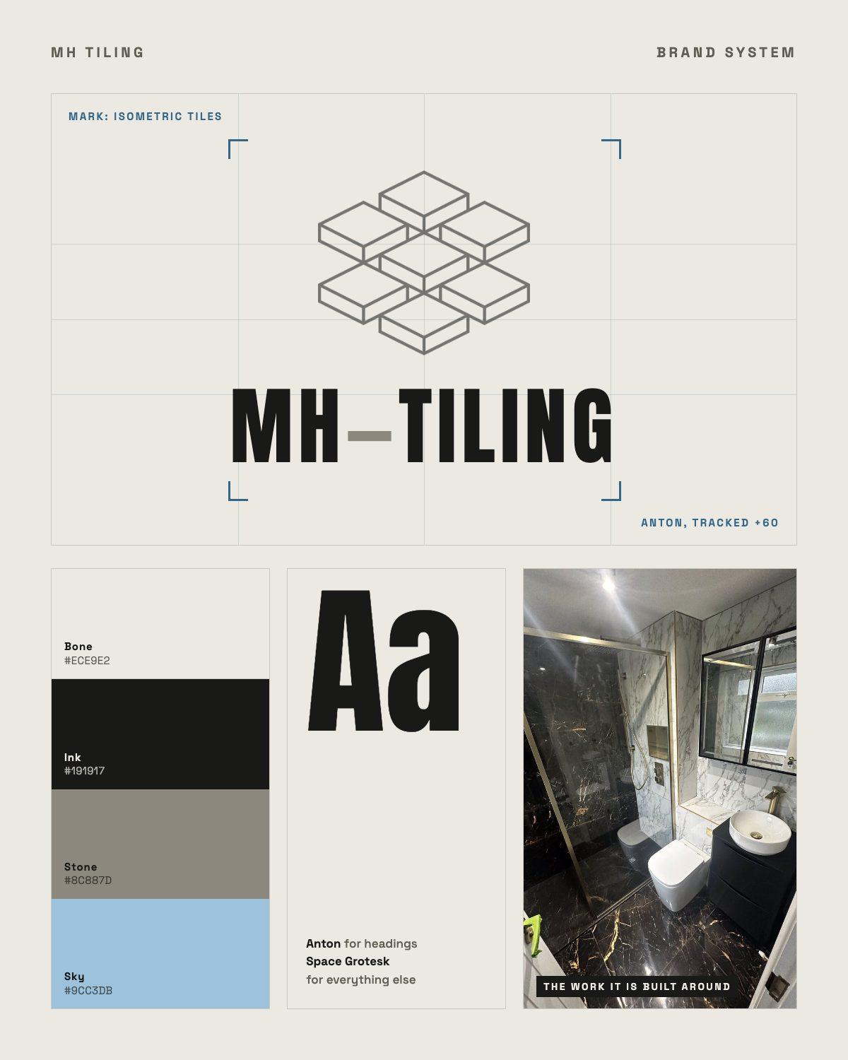
MH Tiling
An isometric tile mark, a wordmark set in Anton, and a bone, stone and sky palette, carried across the site and the brochure.
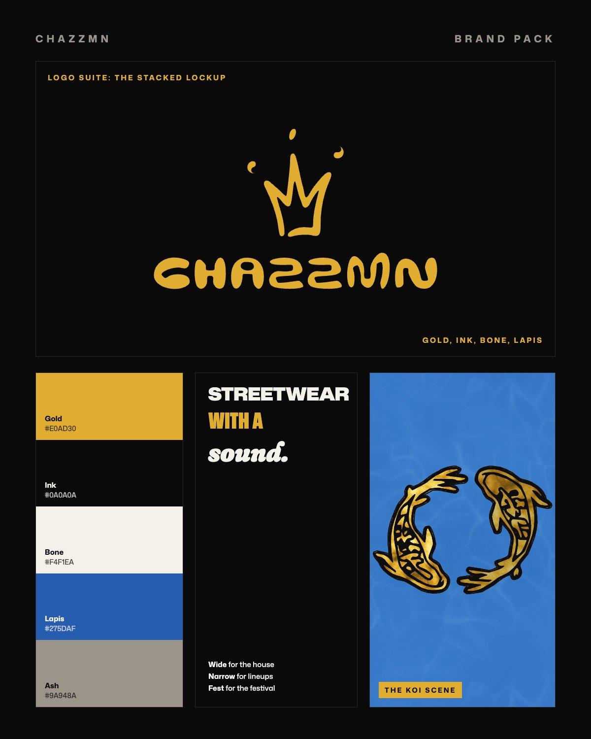
CHAZZMN
Our founder's own label
A full brand pack redrawn from the brand's own marks: a 44-file logo suite, gold, ink, bone and lapis, four type roles and the koi.
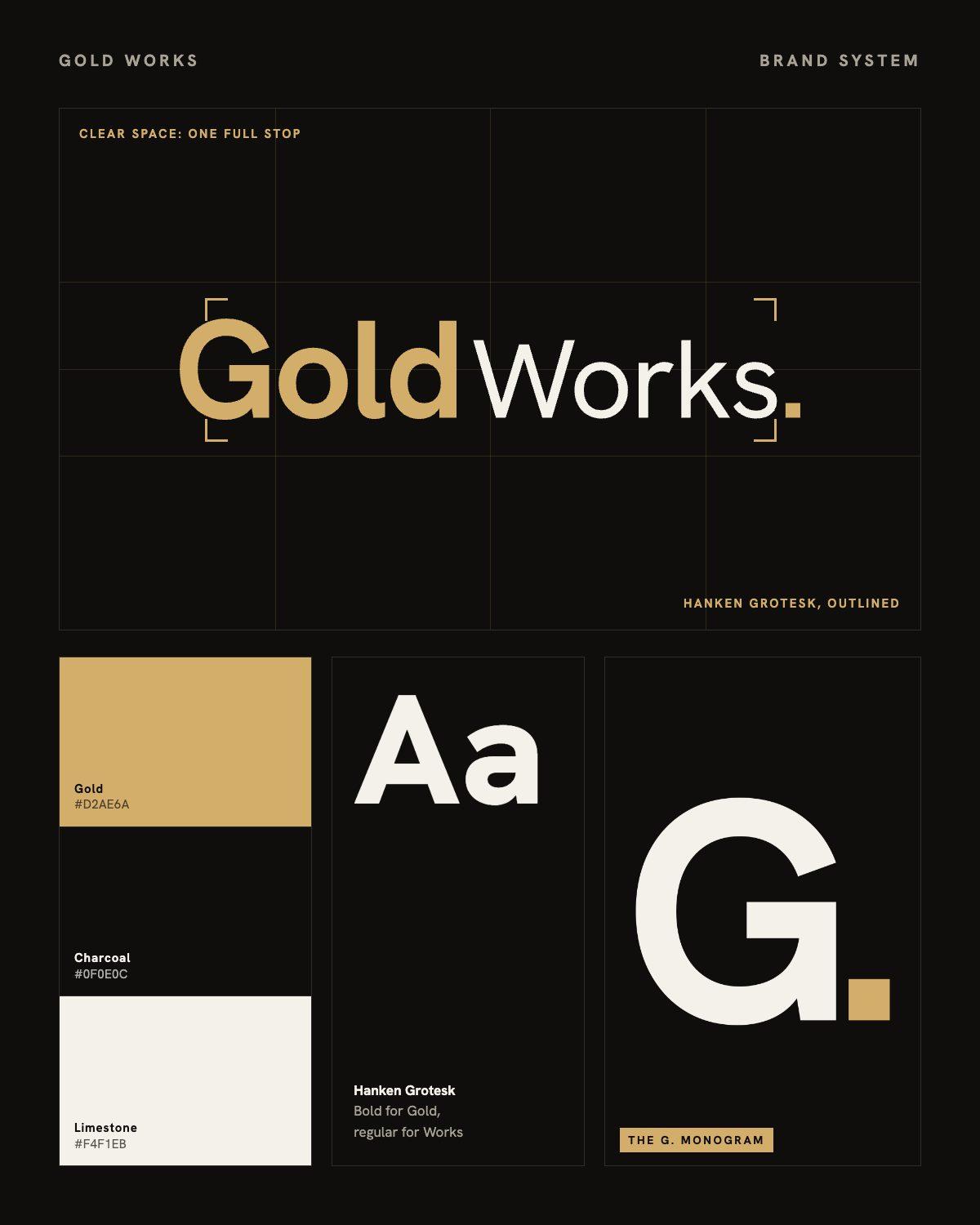
Gold Works
Gold Recruitment became Gold Works: a new wordmark, the G. monogram, and a square full stop that works on its own.
Do you actually need this yet?
Often, no. Here is the honest version:
If the site is the problem, fix the site. Brand work on top of a site nobody visits does not do anything.
Brand work is worth doing when what you look like is actively costing you credibility with the clients you actually want.
Print production and management is not included. We design it, you print it, or we point you at someone good.
Naming and full brand strategy are not standalone products here, unless scoped specifically.
Asked. Answered.
Do I need a full rebrand?
Usually not. Most of what makes a brand look scattered is inconsistency rather than a bad logo, and tightening the rules around what you already have gets you most of the way. If the identity genuinely is the problem we will say so.
Can this be part of a website project?
That is normally how it goes, and normally the right order. The site is the biggest single place the brand shows up, so building both together means they actually match rather than being reconciled afterwards.
What do I actually get at the end?
The identity itself, the rules for using it, and the documents your business sends out. Brand in use, the social graphics and document layouts that keep it alive, is quoted on its own rather than being bundled into the build.
Digitally up to date. You ask, it's done.
Book a free 15-minute consultation.
What your business does, who your best clients are and what isn't working. We'll show you what we'd fix first, and you'll hear the investment on the call.
Prefer to write it down?
Four short steps, about a minute. You'll hear back within two working days.
We use your details only to reply to you, and never share them. See our privacy policy.